- Published on
How to make Advent Calendar
- Authors

- Name
- Kim, Dong-Wook
Table of Contents
Intro
On January 2022, my college senior pula39 suggest me to make advent calendar together. At that time I didn't understand what is it and the concept it has. To sum up, it is like a time casule that we write something on it and reveal it on specific point of time.
When I got the idea of it, I directly said I'm ok to join the project. And I am familiar with Front-End, so I joined as FE.
So this post is for summarizing what I have learned from dealing with Calendar and Modal Components which is very important for FE Developers. I hope this post is helpful for you dev.
Calendar Component Options
If you are using React and also looking for calendar component. We have 3 options you can easily import to your project.
- Pros
- Maintained by Airbnb Corp.
- Have many documents to reference
- Not too hard to customizing style
- Show how to use this library by storybook
- Cons
- React-Dates made with javascript(using prop-types, not typescript)
- Using Momentjs(Still fameous but deprecated, Mutable Type)
- Pros
- Beautiful
- Support Internet Explorer Well(9+)
- Many Calendar Design Types(Monthly, Weekly, Daily, Etc..)
- Cons
- Only Korean users use
- Not many documents
- Hard to Customize
- Pros
- Most fameous(npm weekly download 1.2M)
- Easy to Customize
- Support date-fns option(not momentjs)
- Not Bad Browser Support
- Cons
- Too simple(not many pre-designs)
For Customizing & Considering Launching Plan, I choose to use React-Dates
How to handle React-Dates
Before read this section I hope you know what is Advent Calendar
React-Dates Props
React-Dates have many types of Calendar. But for Zeropage Advent Calendar Project, I choose DayPicker style & using DayPickerSingleDateController component for customizing.
return (
  <DayPickerSingleDateController
    {...props}
    initialVisibleMonth={() => moment('2022-02-01')}
    isOutsideRange={(day) =>
      !isInclusivelyAfterDay(day, moment(process.env.REACT_APP_CALENDAR_START_DATE)) ||
      !isInclusivelyBeforeDay(day, moment(process.env.REACT_APP_CALENDAR_END_DATE))
    }
    transitionDuration={300}
    daySize={DaySizeMemo}
    numberOfMonths={1}
    hideKeyboardShortcutsPanel
    focused={Inputs.focused}
    date={Inputs.date}
    isDayHighlighted={(day1) =>
      Array.from(calendarItems.keys()).some((day2) => isSameDay(day1, moment(day2)))
    }
    onDateChange={handleDateChange}
    onFocusChange={handleFocusChange}
    renderDayContents={renderDayContents}
    renderWeekHeaderElement={renderWeekHeaderElement}
    renderCalendarInfo={renderCalendarInfo}
  />
)
React-Dates named props & callback functions well. But for comprehension, I will explain important props
- isOutSideRange(callback)
- It restrict the dates you can choose
- day value is callback factor & if true is returned, that day is disabled and can't choose
- transitionDuration
- When you move to another month, react-dates give transition animation. It defines the transition time of animation
daySize- react-dates using transition animation, So react-dates doesn't support changing width & height of day scell using css. It should be modified by daySize props.
- I use useMemo Hooks for caching daycell size changing between mobile and desktop size
isDayHighlighted(callback)- It shows which daycell is highlighted.
- This is key prop for showing which daycell is already taken by user.
- day value is callback factor & it true is returned, that day is highlighted
renderDayContents(callback)- This prop make customizing each daycell possible
- it defines daycell rendering style
- renderCalendarInfo(callback)
- Render Caution or user defined content below daycell block
Core Props for implementation
For implementing advent calendar, the core props were daySize, isDayHighlighted, renderDayContents
Because the part that make this project diffult is abstruse css property of react-dates, uncustomizable daycell size by css, reducing searching cost when renderDayContents callback called and search proper data that day has
Let's see how renderDayContents works
When daycell is on rendering process, react-dates call renderDayContents function every time for each daycell. It throws information about day, modifiers. Day is for the day react-dates want to render, modifiers is for the information about that day. Its ADT is Set(), it could contains 'valid', 'hovered', 'blocked', 'blocked-out-of-range' , 'highlighted-calendar', 'first-day-of-week'
const renderDayContents = useCallback(
  (day: moment.Moment, modifiers: ModifiersShape) => {
    if (!isInit) return <div>If data not received, reder nothing</div>
    // Search calendarItem using date as key
    const result = calendarItems.get(day.format('YYYY-MM-DD'))
    if (!result)
      return <>{modifiers.has('valid') && <div>Define style for valid date but not taken</div>}</>
    return (
      <>
        {modifiers.has('highlighted-calendar') && (
          <div>Define style for valikd and taken daycell</div>
        )}
      </>
    )
  },
  [calendarItems, isInit]
)
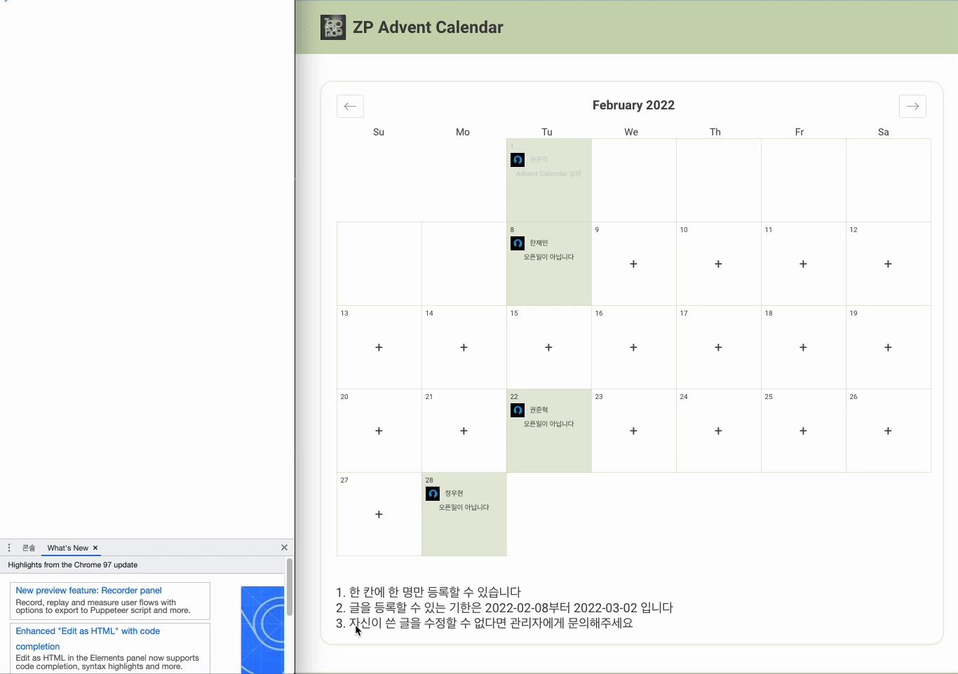
So using conditional rendering, we separate to three daycell designs.
- If data fetching failed or not initialized, show default daycell Design
- If nobody took the daycell, show + button
- If someone took the daycell, show profile image & username
If you don't know the role of modifiers, I thought this part could be diffult.
Data Processing
If I want to show proper data by each cell, we should search the data from Array. The simplest way to implement this is like below
const renderDayContents = useCallback(
  (day: moment.Moment, modifiers: ModifiersShape) => {
    {...}
    const result = calendarItems.find((calendarItem) => isSameDay(day, moment(calendarItem.openDate))
    {...}
  },
  [calendarItems, isInit]
)
But if we just search item without data processing, it takes too long. And renderDayContents is executed on every day cells. So the cost is over O(n^2). I decided to use HashMap ADT. Implemented like below.
	const getCalendarItemsData = useCallback(async () => {
		const data = await getAllCalendars();
		let mapObj = new Map<string, IAdventCalendarItem>();
		for (const key in data) {
			const newKey = moment(data[Number(key)].openDate).format("YYYY-MM-DD");
			mapObj.set(newKey, data[Number(key)]);
		}
		setCalendarsItems(mapObj);
		setInit(true);
	}, []);
Date with format YYYY-MM-DD is set as key of hashmap. So it becomes much faster
Applying Modal System
For better performance and easy usability, apply createPortal & useContext Hook for showing modal on DOM
ModalContext
we created ModalContext.tsx and define states in the file.
export const useModal = (): IModalContext => useContext(ModalContext);

export const ModalProvider: FC = ({ children }) => {
	const [modal, setModal] = {...};
	const [modalOption, setModalOption] = {...};
	const closeModal = {...}
	const openModal = {...}
	const openLoginModal = {...}
	const openCalendarInfoModal = {...}
	const openCalendarCreateModal = {...}
	return (
		<ModalContext.Provider
			value={{
				...
			}}
		>
			{children}
		</ModalContext.Provider>
	);
};
Each modal and modalOption have state which modal is opened for now and data that modal needs
const ModalContainer: FC = () => {
    const {modal, modalOption, closeModal} = useModal();

    const SelectRenderingModal: { [keys in TModal]: JSX.Element } = {
        "CALENDAR-INFO": <CalendarInfoModal onClose={closeModal} options={modalOption}/>,
        "CALENDAR-CREATE": <CalendarCreateModal onClose={closeModal} options={modalOption}/>,
    };

    return (
        <ModalPortal>
            <ModalBase onClose={closeModal} show={!!modal}>
                {modal ? SelectRenderingModal[modal] : null}
            </ModalBase>
        </ModalPortal>
    );
};
In ModalContainer Component, import the state of modal and modalOption. If the modal state is changed, ModalContainer shows the proper Modal Component(We defined CalendarCreate, CalendarInfo Modal)
So this is how front-end of this project implemented
Result

Summary
It is really good project to know how calendar component works.
Thanks to pula39 for asking me to participate in the project
Zeropage Advent Calendar Developers
- woody morgan as FE
- pula39 as BE